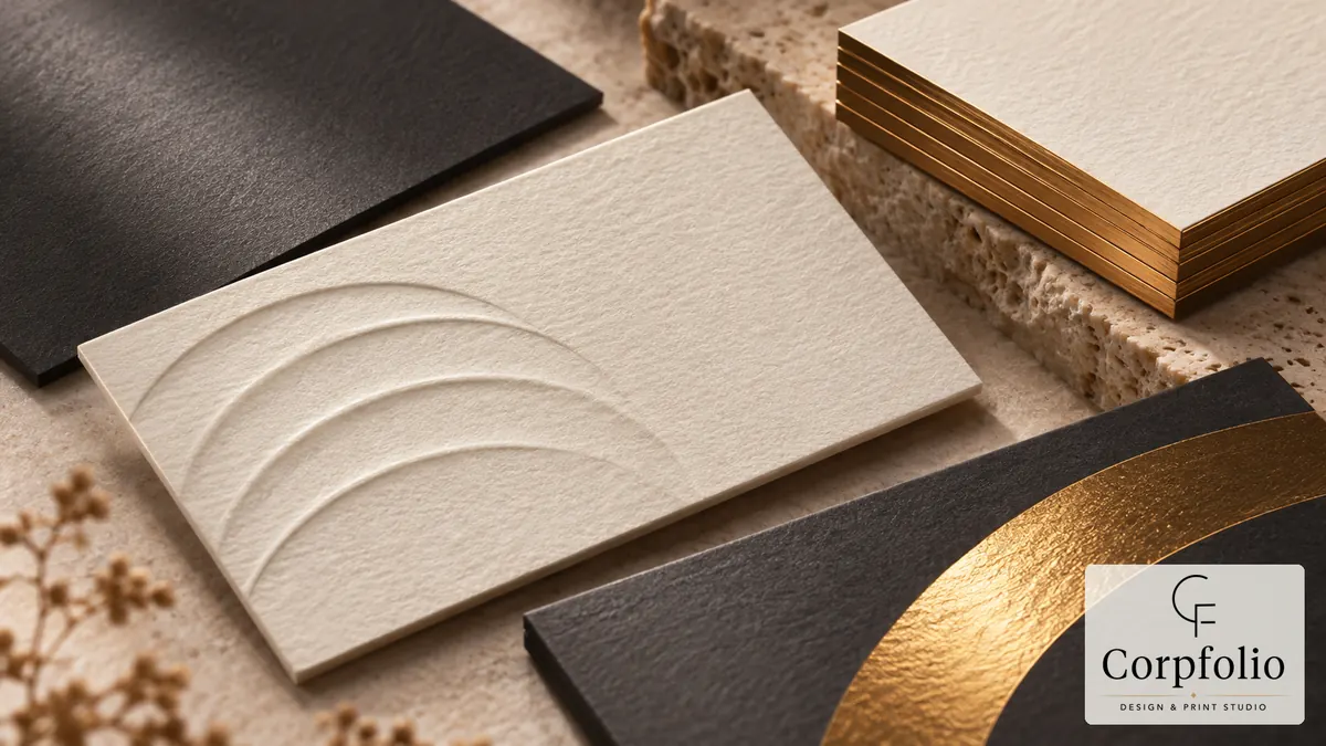
A visiting card is often the first physical thing a client receives from you, and it is judged in the hand before it is read. The finish — foil, spot UV, embossing, letterpress — is what turns a printed rectangle into something people remember. This guide explains what each finish does, where it works best, and what to check before you approve the artwork.
Start with the paper
Every finish behaves differently depending on the stock underneath it. Coated and laminated papers give smooth, crisp results for spot UV and bright foils. Uncoated, cotton and textured papers give a softer, more tactile feel and take letterpress and embossing beautifully, but fine detail and gloss effects can look less sharp. Choose the paper and the finish together, not one after the other.
- Matte or soft-touch laminated stock — a smooth base for spot UV and foil; soft-touch adds a velvety feel
- Uncoated or cotton stock — natural texture, ideal for letterpress, blind embossing and a quieter, premium look
- Coloured or black board — strong contrast for metallic foils and white or coloured edge painting
- Duplexed board — two sheets bonded together for extra thickness and a contrasting colour edge
Foil stamping
Foil stamping uses heat and pressure to apply a thin metallic or coloured film to the card. Gold, silver, copper and rose gold are the most common; matte, holographic and coloured foils are also available.
Works best for: logos, names and short lines of text that you want to catch the light.
Watch out for: very fine lines and small text, which can fill in or break up; large solid areas, which can show small imperfections; and colour expectations — foil reflects light, so it will never look exactly like a flat screen preview.
Spot UV
Spot UV applies a clear, glossy coating to selected areas of the card. On a matte or soft-touch base, the contrast between matte and gloss creates a subtle effect that shows when the card is tilted.
Works best for: logos, patterns and graphic elements over a dark or matte background.
Watch out for: registration — the coating must line up with the printed artwork, so very small details or thin outlines around printed elements are risky. Raised (3D) spot UV gives a thicker, tactile layer but needs even more careful artwork.
Embossing and debossing
Embossing raises part of the card above the surface; debossing presses it into the surface. Both use a pair of dies to shape the paper itself. When there is no ink or foil on the shape, it is called a blind emboss or blind deboss.
Works best for: logos and simple marks on thick, uncoated stock, where the shadow of the shape does the work.
Watch out for: the reverse side — embossing pushes through the sheet and shows as an impression on the back unless the card is duplexed. Fine detail is softened by the paper fibres.
Letterpress
Letterpress presses inked type and artwork into soft, thick paper, leaving a visible and touchable impression. It is one of the oldest printing methods and still one of the most distinctive.
Works best for: clean typography, simple logos and minimal layouts on cotton or heavy uncoated board.
Watch out for: large solid areas of colour, which print less evenly than offset; tight colour matching; and very small text. Letterpress usually suits one or two colours rather than full-colour images.
Other finishes worth knowing
- Edge painting — coloured edges on thick or duplexed cards; striking, especially with a dark stock
- Die-cutting — custom shapes, rounded corners or cut-outs
- Soft-touch lamination — a velvety surface that pairs well with spot UV or foil
- Metallic or pearlescent inks — a subtler shimmer than foil, printed in the normal ink run
What affects cost and lead time
Special finishes add steps to the job, and each step adds setup and time. Foil, embossing and letterpress usually need a custom plate or die made for your artwork, which is a one-off cost that is spread across the quantity printed — so small runs cost more per card than larger ones. Combining finishes multiplies the setups. Thick or duplexed stock, edge painting and die-cut shapes also add handling time.
Lead time is affected in the same way. A plain digitally printed card can be produced quickly; a duplexed letterpress card with foil and edge painting goes through several separate processes and needs more days. If you have a fixed date — an exhibition, a launch, a new hire's first day — plan the finish around it, and allow time for a physical proof.
Keeping cards consistent across a team
For companies ordering cards for many people, set the design as a template: fixed positions for name, title and contact details, agreed rules for long names and titles, and one approved finish. New cards can then be produced from the template without redesigning or re-approving the layout each time, and every card in the company looks like part of the same family.
How to choose
Pick one main finish that suits your brand and use it on one element — usually the logo or the name. A law firm or consultancy might prefer blind embossing or letterpress on cotton stock; a design studio might choose bold foil on black board; a manufacturer might keep it simple with soft-touch and a single spot UV logo. The card should feel consistent with your letterhead, company profile and other stationery, not like a separate project.
Artwork and proof checklist
- Each finish is on its own separate layer or file, clearly named, at 100% black
- Lines and text in foil, spot UV or emboss areas are not too fine for the process
- The finish layer lines up exactly with the printed artwork
- Bleed and safe margins are set for the final trim size and any rounded corners
- The reverse side has been checked for emboss or deboss show-through
- A physical proof or sample of the stock and finish is approved before the full run
- Any QR code links to a page you control and has been tested on several phones
For the wider stationery system, see our corporate stationery service.
Frequently asked questions
Letterpress and foil on a heavy, uncoated stock usually feel the most premium, because they add both texture and depth. Used with restraint — on the logo or name only — they look deliberate rather than decorative.
Yes, but each finish is an extra process and an extra setup cost, and too many effects compete with each other. Most good cards use one main finish, sometimes with a second supporting one.
Spot UV is normally applied over a laminated or coated surface, where the contrast between matte and gloss is strongest. On uncoated stock the effect is weaker and less predictable, so foil or embossing is often a better choice.
Many premium cards use stock in the 350–600 gsm range, or two sheets duplexed together. Thicker boards suit letterpress and edge painting; very heavy stock can make folding and some finishes harder.
Choose the finish with someone who has seen it printed.
Corpfolio designs visiting cards with the paper and finish chosen alongside the artwork. See our visiting card design service, or contact the studio.